Showing posts with label cancer. Show all posts

Monday, November 11, 2013

Latitude and cancer rates in US states: Aaron Blaisdell’s intuition confirmed


In the comments section of my previous post on cancer rates in the US states () my friend Aaron Blaisdell noted that: …comparing states that are roughly comparable in terms of number of seniors per 1000 individuals, latitude appears to have the largest effect on rates of cancer.

Good point, so I collected data on the latitudes of US states, built a more complex model (with several multivariate controls), and analyzed it with WarpPLS 4.0 ().

The coefficient of association for the effect of latitude on cancer rates (path coefficient) turned out to be 0.35. Its P value was lower than 0.001, meaning that the probability that this is a false positive is less than a tenth of a percent, or that we can be 99.9 percent confident that this is not a false positive.

This was calculated controlling for the: (a) proportion of seniors in the population (population age); (b) proportion of obese individuals in the population (obesity rates); and (c) the possible moderating effect of latitude on the effect of population age on cancer rates. The graph below shows this multivariate-adjusted association.


What is cool about a multivariate analysis is that you can control for certain effects. For example, since we are controlling for proportion of seniors in the population (population age), the fact that we have a state with a very low proportion of seniors (Alaska) does not tilt the effect toward that outlier as much as it would if we had not controlled for the proportion of seniors. This is a mathematical property that is difficult to grasp, but that makes multivariate adjustment such a powerful technique.

I should note that the 99.9 percent confidence mentioned above refers to the coefficient of association. That is, we are quite confident that the coefficient of association is not zero; that is it. The P value does not support the hypothesized direction of causality (latitude -> cancer) or exclude the possibility of a major confounder causing the effect.

Nonetheless, among the newest features of WarpPLS 4.0 (still a beta version) are several causality assessment coefficients: path-correlation signs, R-squared contributions, path-correlation ratios, path-correlation differences, Warp2 bivariate causal direction ratios, Warp2 bivariate causal direction differences, Warp3 bivariate causal direction ratios, and Warp3 bivariate causal direction differences. Without going into a lot of technical detail, which you can get from the User Manual () without even having to install the software, I can tell you that all of these causality assessment coefficients support the hypothesized direction of causality.

Also, while we cannot exclude the possibility of a major confounder causing the effect, we included two possible confounders in the analysis and controlled for their effects. They were the proportion of seniors in the population (population age) and the proportion of obese individuals in the population (obesity rates).

Having said all of the above, I should also say that the effect is similar in magnitude to the effect of population age on cancer rates, which I discussed in the previous post linked above. That is, it is not the type of effect that would be clearly noticeable in a person’s normal life.

Sunlight exposure? Maybe.

We do know that our body naturally produces as much as 10,000 IU of vitamin D based on a few minutes of sun exposure when the sun is high (). Getting that much vitamin D from dietary sources is very difficult, even after “fortification”.

Monday, October 28, 2013

Aging and cancer: The importance of taking a hard look at the numbers


The table below is from a study by Hayat and colleagues (). It illustrates one common trend regarding cancer – it increases dramatically in incidence among those who are older. With some exceptions, such as Hodgkin's lymphoma, there is a significant increase in risk particularly after 50 years of age.


So I decided to get state data from the US Census web site (), on the percentage of seniors (age 65 or older) by state and cancer diagnoses per 1,000 people. I was able to get some recent data, for 2011.

I analyzed the data with WarpPLS (version 4.0 has been just released: ), generating the types of coefficients that would normally be reported by researchers who wanted to make an effect appear very strong.

In this case, the effect would be essentially of population aging on cancer incidence (assessed indirectly), summarized in the graph below. The graph was generated by WarpPLS. The scales are standardized, and so are the coefficients of association in the two segments shown. As you can see, the coefficients of association increase as we move along the horizontal scale, because this is a nonlinear relationship. The overall coefficient of association, which is a weighted average of the two betas shown, is 0.84. The probability that this is a false positive is less than 1 percent.


A beta coefficient of 0.84 essentially means that a 1 standard deviation variation in the percentage of seniors in a state is associated with an overall 84 percent increase in cancer diagnoses, taking the standardized unit of the number of cancer diagnoses as the baseline. This sounds very strong and would usually be presented as an enormous effect. Since the standard deviation for the percentage of seniors in various states is 1.67, one could say that for each 1.67 increment in the percentage of seniors in a state the number of cancer diagnoses goes up by 84 percent.

Effects expressed in percentages can sometimes give a very misleading picture. For example, let us consider an increase in mortality due to a disease from 1 to 2 cases for each 1 million people. This essentially is a 100 percent increase! Moreover, the closer the baseline is from zero, the more impressive the effect becomes, since the percentage increase is calculated by dividing the increment by the baseline number. As the baseline number approaches zero, the percentage increase from the baseline approaches infinity.

Now let us take a look at the graph below, also generated by WarpPLS. Here the scales are unstandardized, which means that they refer to the original measures in their respective original scales. (Standardization makes the variables dimensionless, which is sometimes useful when the original measurement scales are not comparable – e.g., dollars vs. meters.) As you can see here, the number of cancer diagnoses per 1,000 people goes from a low of 3.74 in Utah to a high of 6.64 in Maine.


One may be tempted to explain the increase in cancer diagnoses that we see on this graph based on various factors (e.g., lifestyle), but the percentage of seniors in a state seems like a very good and reasonable predictor. You may say: This is very depressing. You may be even more depressed if I tell you that controlling for state obesity rates does not change this picture at all.

But look at what these numbers really mean. What we see here is an increase in cancer diagnoses per 1,000 people of less than 3. In other words, there is a minute increase of less than 3 diagnoses for each group of 1,000 people considered. It certainly feels terrible if you are one of the 3 diagnosed, but it is still a minute increase.

Also note that one of the scales, for diagnoses, refers to increments of 1 in 1,000; while the other, for seniors, refers to increments of 1 in 100. This leads to an interesting effect. If you move from Alaska to Florida you will see a significant increase in the number of seniors around, as the difference in the percentage of seniors between these two states is about 10. However, the difference in the number of cancer diagnoses will not be even close to the difference in the presence of seniors.

The situation above is very common in medical research. An effect that is fundamentally tiny is stated in such a way that the general public has the impression that the effect is enormous. Often the reason is not to promote a drug, but to attract media attention to a research group or organization.

When you look at the actual numbers, the magnitude of the effect is such that it would go unnoticed in real life. By real life I mean: John, since we moved from Alaska to Maine I have been seeing a lot more people of my age being diagnosed with cancer. An effect of the order of 3 in 1,000 would not normally be noticed in real life by someone whose immediate circle of regular acquaintances included fewer than 333 people (about 1,000 divided by 3).

But thanks to Facebook, things are changing … to be fair, the traditional news media (particularly television) tends to increase perceived effects a lot more than social media, often in a very stressful way.

Monday, May 7, 2012

The 2012 Arch Intern Med red meat-mortality study: The “protective” effect of smoking

In a previous post () I used WarpPLS () to analyze the model below, using data reported in a recent study looking at the relationship between red meat consumption and mortality. The model below shows the different paths through which smoking influences mortality, highlighted in red. The study was not about smoking, but data was collected on that variable; hence this post.


When one builds a model like the one above, and tests it with empirical data, the person does something similar to what a physicist would do. The model is a graphical representation of a complex equation, which embodies the beliefs of the modeler. WarpPLS builds the complex equation automatically for the user, who would otherwise have to write it down using mathematical symbols.

The results yielded by the complex equation, partly in the form of coefficients of association for direct relationships (the betas next to the arrows), have a meaning. Some may look odd, and require novel interpretations, much in the same way that odd results from an equation describing planetary motions may have led to the development of the theory of black holes.

Nothing is actually "proven" by the results. They are part of the long and painstaking process we call "research". To advance new knowledge, one needs a lot more than a single study. Darwin's theory of evolution is still being tested. Based on various tests and partial refutations, it has itself evolved a great deal since its original formulation.

One set of results that are generated based on the model above by WarpPLS, in addition to coefficients for direct relationships, are coefficients of association called "total effects". They aggregate all of the effects, via multiple paths, between each pair of variables. Below is a table of total effects, with the total effects of smoking on diabetes incidence and overall mortality highlighted in red.


As you can see, the total effects of smoking on diabetes incidence and overall mortality are negative, but small enough to be considered insignificant. This is interesting, because smoking is definitely not health-promoting. Among hunter-gatherers, who often smoke tobacco, it increases the incidence of various types of cancer (). And it may be at the source of many of the health problems suggested by analyses on the China Study II data ().

So what are these results telling us? They tell us that smoking has an intermediate protective effect, very likely associated with its anorexic effect. Smoking is an appetite suppressor. Its total effect on food intake is negative, and strong. As we can see from the table of total effects, just below the two numbers highlighted in red, the total effect of smoking on food intake is -0.356.

Still, it looks like smoking is nearly as bad as overeating to the point of becoming obese (), in terms of its overall effect on health. Otherwise we would see a positive total effect on overall mortality of comparable strength to the negative total effect on food intake.

Smoking may make one eat less, but it ends up hastening one’s demise through different paths.

Monday, February 13, 2012

Does pork consumption cause cirrhosis? Perhaps, if people become obese from eating pork

The idea that pork consumption may cause cirrhosis has been around for a while. A fairly widely cited 1985 study by Nanji and French () provides one of the strongest indictments of pork: “In countries with low alcohol consumption, no correlation was obtained between alcohol consumption and cirrhosis. However, a significant correlation was obtained between cirrhosis and pork.”

Recently Paul Jaminet wrote a blog post on the possible link between pork consumption and cirrhosis (). Paul should be commended for bringing this topic to the fore, as the implications are far-reaching and very serious. One of the key studies mentioned in Paul’s post is a 2009 article by Bridges (), from which the graphs below were taken.


The graphs above show a correlation between cirrhosis and alcohol consumption of 0.71, and a correlation between cirrhosis and pork consumption of 0.83. That is, the correlation between cirrhosis and pork consumption is the stronger of the two! Combining this with the Nanji and French study, we have evidence that: (a) in countries with low alcohol consumption we can find a significant correlation between cirrhosis and pork consumption; and (b) in countries where both alcohol and pork are consumed, pork consumption has the strongest correlation with cirrhosis.

Do we need anything else to ban pork from our diets? Yes, we do, as there is more to this story.

Clearly alcohol and pork consumption are correlated as well, as we can see from the graphs above. That is, countries where alcohol is consumed more heavily also tend to have higher levels of pork consumption. If alcohol and pork consumption are correlated, then a multivariate analysis of their effects should be conducted, as one of the hypothesized effects (of alcohol or pork) on cirrhosis may even disappear after controlling for the other effect.

I created a dataset, as best as I could, based on the graphs from the Bridges article. (I could not get the data online.) I then entered it into WarpPLS (). I wanted to run a moderating effect analysis, which is a form of nonlinear multivariate analysis. This is important, because the association between alcohol consumption and disease in general is well known to be nonlinear.

In fact, the relationship between alcohol consumption and disease is often used as a classic example of hormesis (), and its characteristic J-curve shape. Since correlation is a measure of linear association, the lower correlation between alcohol consumption and cirrhosis, when compared with pork consumption, may be just a “mirage of linearity”. In multivariate analyses, this mirage of linearity may lead to what are known as type I and II errors, at the same time ().

I should note that the Bridges study did something akin to a moderating effect analysis; through an analysis of the interaction between alcohol and pork consumption. However, in that analysis the values of the variables that were multiplied to create a “dummy” interaction variable were on their original scales, which can be a major source of bias. A more advisable way to conduct an interaction effect analysis is to first make the variables dimensionless, by standardizing them, and then creating a dummy interaction variable as a product of the two variables. That is what WarpPLS does for moderating effects’ estimation.

One more detour, leading to an important implication, and then we will get to the results. In a 1988 article, Jeanneret and colleagues show evidence of a strong and possibly causal association between alcohol consumption and protein-rich diets (). One possible implication of this is that in countries where pork is a dietary staple, like Denmark and Germany, alcohol consumption should be strongly and causally associated with pork consumption. (I guess Anthony Bordain would agree with this eh?)

Below are the results of a multivariate analysis on a model that incorporates the above implication, by including a link between alcohol and pork consumption. The model also explores the role of pork consumption as a moderator of the relationship between alcohol and cirrhosis, as well as the direct effect of pork consumption on cirrhosis. Finally, the total effects of alcohol and pork consumption on cirrhosis are also investigated; they are shown on the left.


The total effects are both statistically significant, with the total effect of alcohol consumption being 94 percent stronger than the total effect of pork consumption on cirrhosis. Looking at the model, alcohol consumption is strongly associated with pork consumption (which is consistent with Jeanneret and colleagues’s study). Alcohol consumption is also strongly associated with cirrhosis, through a direct effect; much more so than pork. Finally, pork consumption seems to strengthen the relationship between alcohol consumption and cirrhosis (the moderating effect).

As we can see the relationship between pork consumption and cirrhosis is still there, in moderating and direct effects, even though it seems to be a lot weaker than that between alcohol consumption and cirrhosis. Why does pork seem to influence cirrhosis at all in this dataset?

Well, 
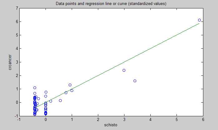
there is another factor that is strongly associated with cirrhosis, and that is obesity (). In fact, obesity is associated with just about any major disease, including various types of cancer ().

And in countries where pork is a dietary staple, isn’t it reasonable to assume that pork consumption will play a role in obesity? Often folks who consume a lot of addictive industrial foods (e.g., bread, candy, regular sodas) also eat plenty of foods with saturated fat; and the latter end up showing up in disease statistics, misleadingly supporting the lipid hypothesis. The phenomenon involving pork and cirrhosis may well be similar.

But you may find the above results and argument not convincing enough. Maybe you want to see some evidence that pork is actually good for one’s health. The results above suggest that it may not be bad at all, if you buy into the obesity angle, but not that it can be good.

So I downloaded the most recent data from Nationmaster.com () on the following variables: pork consumption, alcohol consumption, and life expectancy. The list of countries was a bit larger than and different from that in the Bridges study; the following countries were included: Australia, Brazil, Canada, China, Denmark, France, Germany, Hong Kong, Hungary, Japan, Mexico, Poland, Russia, Singapore, Spain, Sweden, United Kingdom, and United States. Below are the results of a simple multivariate analysis with WarpPLS.


As with the Bridges dataset, there is a strong multivariate association between alcohol and pork consumption (0.43). The multivariate association between alcohol consumption and life expectancy is negative (-0.14). The multivariate association between pork consumption and life expectancy is positive (0.36). Neither association is statistically significant, although the association involving pork consumption gets close to significance with a P=0.11 (a confidence level of 89 percent; calculated through jackknifing, a nonparametric technique). The graphs show the plots for the associations and the best-fitting lines; the blue dashed arrows indicate the multivariate associations to which the graphs refer. So, in this second dataset from Nationmaster.com, the more pork is consumed in a country, the longer is the life expectancy in that country.

In other words, for each 1 standard deviation variation in pork consumption, there is a 0.36 standard deviation variation in life expectancy, after we control for alcohol consumption. The standard deviation for pork consumption is 36.281 lbs/person/year, or 45.087 g/person/day; for life expectancy, it is 4.677 years. Working the numbers a bit more, the results above suggest that each extra gram of pork consumed per person per day is associated with approximately 13 additional days of overall life expectancy in a country! This is calculated as: 4.677/45.087*0.36*365 = 13.630.

Does this prove that eating pork will make you live longer? No single study will “prove” something like that. Pork consumption is also likely a marker for wealth in a country; and wealth is strongly and positively associated with life expectancy at the country level. Moreover, when you aggregate dietary and disease incidence data by country, often the statistical effects are caused by those people in the dietary extremes (e.g., alcohol abuse, not moderate consumption). Finally, if people avoid death from certain diseases, they will die in higher quantities from other diseases, which may bias statistical results toward what may look like a higher incidence of those other diseases.

What the results summarized in this post do suggest is that pork consumption may not be a problem at all, unless you become obese from eating it. How do you get obese from eating pork? Eating it together with industrial foods that are addictive would probably help.

Monday, January 23, 2012

All diets succeed at first, and eventually fail

It is not very hard to find studies supporting one diet or another. Gardner and colleagues, for example, conducted a study in which the Atkins diet came out on top when compared with the Zone, Ornish, and LEARN diets (). In Dansinger and colleagues’ study (), on the other hand, following the Atkins diet led to relatively poor results compared with the Ornish, Weight Watchers, and Zone diets.

Often the diets compared have different macronutrient ratios, which end up becoming the focus of the comparison. Many consider Sacks and colleagues’ conclusion, based on yet another diet comparison study (), to be the most consistent with the body of evidence as a whole: “Reduced-calorie diets result in clinically meaningful weight loss regardless of which macronutrients they emphasize”.

I think there is a different conclusion that is even more consistent with the body of evidence out there. This conclusion is highlighted by the findings of almost all diet studies where participants were followed for more than 1 year. But the relevant findings are typically buried in the papers that summarize the studies, and are almost never mentioned in the abstracts. Take for example the study by Toubro and Astrup (); Figure 3 below is used by the authors to highlight the study’s main reported finding: “Ad lib, low fat, high carbohydrate diet was superior to fixed energy intake for maintaining weight after a major weight loss”.


But what does the figure above really tell us? It tells us, quite simply, that both diets succeeded at first, and then eventually failed. One failed slightly less miserably than the other, in this study. The percentage of subjects that maintained a weight loss above 25 kg (about 55 lbs) approached zero after 12 months, in both diets. This leads us to the conclusion below, which is always missing in diet studies even when the evidence is staring back at us. This is arguably the conclusion that is the most consistent with the body of evidence out there.

All diets succeed at first, and eventually fail.

In using the terms “succeed” and “fail” I am referring to the diets’ effects on the majority of the participants. This is in fact better demonstrated by the figure below, from the same study by Toubro and Astrup; it is labeled as Figure 2 there. Most of the participants at a certain weight, lose a lot of weight within a period of 1 year or so, and after 2 years (see the two points at the far right) are at the same original weight again. What is the average time to regain back the weight? From what I’ve seen in the literature, all the weight and some tends to be regained after 2-3 years.


The regained weight is not at all lean body mass. It is primarily, if not entirely, body fat. In fact, many studies suggest that those who diet tend to have a higher percentage of body fat when they regain their original weight; proportionally to how fast they regain the weight lost. Since the extra body fat tends to cause additional problems, which are compounded by the dieting process’ toll on the body, those dieters would have been slightly better off not having dieted in the first place.

Guyenet and Schwartz have recently authored an article that summarizes quite nicely what tends to happen with both obese and lean dieters (). Take a look at Figure 2 of the article below. The obese need to lose body fat to improve health markers, and avoid a number of downstream complications, such as type 2 diabetes and cancer (). Yet, with very few exceptions, the obese (and even the overweight) remain obese (or overweight) after dieting; regardless of the diet.


So what about those exceptions, what do they do to lose significant amounts of body fat and keep it off? Well, I rarely use myself as an example for anything in this blog, but this is something with which I unfortunately/fortunately have personal experience. I was obese, lost about 60 lbs of weight, and kept it off for quite a while already (). Like most of the formerly obese, I can very easily gain body fat back.

But I don’t seem to be gaining back the formerly lost body fat, and the reason is consistent with some of the studies based on data from the National Weight Control Registry, which stores information about adults who lost 30 lbs or more of weight and kept it off for at least 1 year (). I systematically measure my weight, body fat percentage, and a number of other variables; probably even more than the average National Weight Control Registry member. Based on those measurements, I try to understand how my body responds in the short and long term to stimuli such as different exercise, types of food, calorie restriction, sleep patterns etc.

And I act accordingly to keep any body fat gain from happening; by, for example, varying calorie intake, increasing exercise intensity, varying the types of food I eat etc. With a few exceptions (e.g., avoiding industrial seed oils), there is no generic formula. Customization based on individual responses and cyclical patterns seems to be a must.

Looking back, it was relatively easy for me to lose all that fat. This is consistent with the studies summarized in this post; all diets that rely on caloric reduction work marvelously at first for most people. The really difficult part is to keep the body fat off. I believe that this is especially true as the initial years go by, and becomes easier after that. This has something to do with initial inertia, which I will discuss soon in a post on metabolic rates and their relationship with overall body mass.

For people living in the wild, I can see one thing working in their favor. And that is not regular starvation; sapiens is too smart for that. It is laziness. Hunger has to reach a certain threshold for people to want to do some work to get their food; this acts as a natural body composition regulator, something that I intend to discuss in one of my next posts. It seems that people almost never become obese in the wild, without access to industrial foods.

As for living in the wild, in spite of the romantic portrayals of it, the experience is not as appealing after you really try it. The book Yanomamo: The Fierce People () is a solid, if not somewhat shocking, reminder of that. I had the opportunity to meet and talk at length with its author, the great anthropologist Nap Chagnon, at one of the Human Behavior and Evolution Society conferences. The man is a real-life Indiana Jones ().

In the formerly obese, the body seems to resort to “guerrilla warfare”, employing all kinds of physiological and psychological mechanisms, some more subtle than others, to make sure that the lost fat is recovered. Why? I have some ideas, which I have discussed indirectly in posts throughout this blog, but I still need to understand the whole process a bit better. My ideas build on the notion of compensatory adaptation ().

You might have heard some very smart people say that you do not need to measure anything to lose body fat and keep it off. Many of those people have never been obese. Those who have been obese often had not cleared the 2-3 year “danger zone” by the time they made those statements.

There are many obese or overweight public figures (TV show hosts, actors, even health bloggers) who embark on a diet and lose a dramatic amount of body fat. They talk and/or write for a year or so about their success, and then either “disappear” or start complaining about health issues. Those health issues are often part of the “guerrilla warfare” I mentioned above.

A few persistent public figures will gain the fat back, in part or fully, and do the process all over again. It makes for interesting drama, and at least keeps those folks in the limelight.

Saturday, July 24, 2010

The China Study one more time: Are raw plant foods giving people cancer?

In this previous post I analyzed some data from the China Study that included counties where there were cases of schistosomiasis infection. Following one of Denise Minger’s suggestions, I removed all those counties from the data. I was left with 29 counties, a much smaller sample size. I then ran a multivariate analysis using WarpPLS (warppls.com), like in the previous post, but this time I used an algorithm that identifies nonlinear relationships between variables.

Below is the model with the results. (Click on it to enlarge. Use the "CRTL" and "+" keys to zoom in, and CRTL" and "-" to zoom out.) As in the previous post, the arrows explore associations between variables. The variables are shown within ovals. The meaning of each variable is the following: aprotein = animal protein consumption; pprotein = plant protein consumption; cholest = total cholesterol; crcancer = colorectal cancer.


What is total cholesterol doing at the right part of the graph? It is there because I am analyzing the associations between animal protein and plant protein consumption with colorectal cancer, controlling for the possible confounding effect of total cholesterol.

I am not hypothesizing anything regarding total cholesterol, even though this variable is shown as pointing at colorectal cancer. I am just controlling for it. This is the type of thing one can do in multivariate analyzes. This is how you “control for the effect of a variable” in an analysis like this.

Since the sample is fairly small, we end up with insignificant beta coefficients that would normally be statistically significant with a larger sample. But it helps that we are using nonparametric statistics, because they are still robust in the presence of small samples, and deviations from normality. Also the nonlinear algorithm is more sensitive to relationships that do not fit a classic linear pattern. We can summarize the findings as follows:

- As animal protein consumption increases, plant protein consumption decreases significantly (beta=-0.36; P<0.01). This is to be expected and helpful in the analysis, as it differentiates somewhat animal from plant protein consumers. Those folks who got more of their protein from animal foods tended to get significantly less protein from plant foods.

- As animal protein consumption increases, colorectal cancer decreases, but not in a statistically significant way (beta=-0.31; P=0.10). The beta here is certainly high, and the likelihood that the relationship is real is 90 percent, even with such a small sample.

- As plant protein consumption increases, colorectal cancer increases significantly (beta=0.47; P<0.01). The small sample size was not enough to make this association insignificant. The reason is that the distribution pattern of the data here is very indicative of a real association, which is reflected in the low P value.

Remember, these results are not confounded by schistosomiasis infection, because we are only looking at counties where there were no cases of schistosomiasis infection. These results are not confounded by total cholesterol either, because we controlled for that possible confounding effect. Now, control variable or not, you would be correct to point out that the association between total cholesterol and colorectal cancer is high (beta=0.58; P=0.01). So let us take a look at the shape of that association:


Does this graph remind you of the one on this post; the one with several U curves? Yes. And why is that? Maybe it reflects a tendency among the folks who had low cholesterol to have more cancer because the body needs cholesterol to fight disease, and cancer is a disease. And maybe it reflects a tendency among the folks who have high total cholesterol to do so because total cholesterol (and particularly its main component, LDL cholesterol) is in part a marker of disease, and cancer is often a culmination of various metabolic disorders (e.g., the metabolic syndrome) that are nothing but one disease after another.

To believe that total cholesterol causes colorectal cancer is nonsensical because total cholesterol is generally increased by consumption of animal products, of which animal protein consumption is a proxy. (In this reduced dataset, the linear univariate correlation between animal protein consumption and total cholesterol is a significant and positive 0.36.) And animal protein consumption seems to be protective again colorectal cancer in this dataset (negative association on the model graph).

Now comes the part that I find the most ironic about this whole discussion in the blogosphere that has been going on recently about the China Study; and the answer to the question posed in the title of this post: Are raw plant foods giving people cancer? If you think that the answer is “yes”, think again. The variable that is strongly associated with colorectal cancer is plant protein consumption.

Do fruits, veggies, and other plant foods that can be consumed raw have a lot of protein?

With a few exceptions, like nuts, they do not. Most raw plant foods have trace amounts of protein, especially when compared with foods made from refined grains and seeds (e.g., wheat grains, soybean seeds). So the contribution of raw fruits and veggies in general could not have influenced much the variable plant protein consumption. To put this in perspective, the average plant protein consumption per day in this dataset was 63 g; even if they were eating 30 bananas a day, the study participants would not get half that much protein from bananas.

Refined foods made from grains and seeds are made from those plant parts that the plants absolutely do not “want” animals to eat. They are the plants’ “children” or “children’s nutritional reserves”, so to speak. This is why they are packed with nutrients, including protein and carbohydrates, but also often toxic and/or unpalatable to animals (including humans) when eaten raw.

But humans are so smart; they learned how to industrially refine grains and seeds for consumption. The resulting human-engineered products (usually engineered to sell as many units as possible, not to make you healthy) normally taste delicious, so you tend to eat a lot of them. They also tend to raise blood sugar to abnormally high levels, because industrial refining makes their high carbohydrate content easily digestible. Refined foods made from grains and seeds also tend to cause leaky gut problems, and autoimmune disorders like celiac disease. Yep, we humans are really smart.

Thanks again to Dr. Campbell and his colleagues for collecting and compiling the China Study data, and to Ms. Minger for making the data available in easily downloadable format and for doing some superb analyses herself.

Thursday, July 22, 2010

The China Study again: A multivariate analysis suggesting that schistosomiasis rules!

In the comments section of Denise Minger’s post on July 16, 2010, which discusses some of the data from the China Study (as a follow up to a previous post on the same topic), Denise herself posted the data she used in her analysis. This data is from the China Study. So I decided to take a look at that data and do a couple of multivariate analyzes with it using WarpPLS (warppls.com).

First I built a model that explores relationships with the goal of testing the assumption that the consumption of animal protein causes colorectal cancer, via an intermediate effect on total cholesterol. I built the model with various hypothesized associations to explore several relationships simultaneously, including some commonsense ones. Including commonsense relationships is usually a good idea in exploratory multivariate analyses.

The model is shown on the graph below, with the results. (Click on it to enlarge. Use the "CRTL" and "+" keys to zoom in, and CRTL" and "-" to zoom out.) The arrows explore causative associations between variables. The variables are shown within ovals. The meaning of each variable is the following: aprotein = animal protein consumption; pprotein = plant protein consumption; cholest = total cholesterol; crcancer = colorectal cancer.


The path coefficients (indicated as beta coefficients) reflect the strength of the relationships; they are a bit like standard univariate (or Pearson) correlation coefficients, except that they take into consideration multivariate relationships (they control for competing effects on each variable). A negative beta means that the relationship is negative; i.e., an increase in a variable is associated with a decrease in the variable that it points to.

The P values indicate the statistical significance of the relationship; a P lower than 0.05 means a significant relationship (95 percent or higher likelihood that the relationship is real). The R-squared values reflect the percentage of explained variance for certain variables; the higher they are, the better the model fit with the data. Ignore the “(R)1i” below the variable names; it simply means that each of the variables is measured through a single indicator (or a single measure; that is, the variables are not latent variables).

I should note that the P values have been calculated using a nonparametric technique, a form of resampling called jackknifing, which does not require the assumption that the data is normally distributed to be met. This is good, because I checked the data, and it does not look like it is normally distributed. So what does the model above tell us? It tells us that:

- As animal protein consumption increases, colorectal cancer decreases, but not in a statistically significant way (beta=-0.13; P=0.11).

- As animal protein consumption increases, plant protein consumption decreases significantly (beta=-0.19; P<0.01). This is to be expected.

- As plant protein consumption increases, colorectal cancer increases significantly (beta=0.30; P=0.03). This is statistically significant because the P is lower than 0.05.

- As animal protein consumption increases, total cholesterol increases significantly (beta=0.20; P<0.01). No surprise here. And, by the way, the total cholesterol levels in this study are quite low; an overall increase in them would probably be healthy.

- As plant protein consumption increases, total cholesterol decreases significantly (beta=-0.23; P=0.02). No surprise here either, because plant protein consumption is negatively associated with animal protein consumption; and the latter tends to increase total cholesterol.

- As total cholesterol increases, colorectal cancer increases significantly (beta=0.45; P<0.01). Big surprise here!

Why the big surprise with the apparently strong relationship between total cholesterol and colorectal cancer? The reason is that it does not make sense, because animal protein consumption seems to increase total cholesterol (which we know it usually does), and yet animal protein consumption seems to decrease colorectal cancer.

When something like this happens in a multivariate analysis, it usually is due to the model not incorporating a variable that has important relationships with the other variables. In other words, the model is incomplete, hence the nonsensical results. As I said before in a previous post, relationships among variables that are implied by coefficients of association must also make sense.

Now, Denise pointed out that the missing variable here possibly is schistosomiasis infection. The dataset that she provided included that variable, even though there were some missing values (about 28 percent of the data for that variable was missing), so I added it to the model in a way that seems to make sense. The new model is shown on the graph below. In the model, schisto = schistosomiasis infection.


So what does this new, and more complete, model tell us? It tells us some of the things that the previous model told us, but a few new things, which make a lot more sense. Note that this model fits the data much better than the previous one, particularly regarding the overall effect on colorectal cancer, which is indicated by the high R-squared value for that variable (R-squared=0.73). Most notably, this new model tells us that:

- As schistosomiasis infection increases, colorectal cancer increases significantly (beta=0.83; P<0.01). This is a MUCH STRONGER relationship than the previous one between total cholesterol and colorectal cancer; even though some data on schistosomiasis infection for a few counties is missing (the relationship might have been even stronger with a complete dataset). And this strong relationship makes sense, because schistosomiasis infection is indeed associated with increased cancer rates. More information on schistosomiasis infections can be found here.

- Schistosomiasis infection has no significant relationship with these variables: animal protein consumption, plant protein consumption, or total cholesterol. This makes sense, as the infection is caused by a worm that is not normally present in plant or animal food, and the infection itself is not specifically associated with abnormalities that would lead one to expect major increases in total cholesterol.

- Animal protein consumption has no significant relationship with colorectal cancer. The beta here is very low, and negative (beta=-0.03).

- Plant protein consumption has no significant relationship with colorectal cancer. The beta for this association is positive and nontrivial (beta=0.15), but the P value is too high (P=0.20) for us to discard chance within the context of this dataset. A more targeted dataset, with data on specific plant foods (e.g., wheat-based foods), could yield different results – maybe more significant associations, maybe less significant.

Below is the plot showing the relationship between schistosomiasis infection and colorectal cancer. The values are standardized, which means that the zero on the horizontal axis is the mean of the schistosomiasis infection numbers in the dataset. The shape of the plot is the same as the one with the unstandardized data. As you can see, the data points are very close to a line, which suggests a very strong linear association.


So, in summary, this multivariate analysis vindicates pretty much everything that Denise said in her July 16, 2010 post. It even supports Denise’s warning about jumping to conclusions too early regarding the possible relationship between wheat consumption and colorectal cancer (previously highlighted by a univariate analysis). Not that those conclusions are wrong; they may well be correct.

This multivariate analysis also supports Dr. Campbell’s assertion about the quality of the China Study data. The data that I analyzed was already grouped by county, so the sample size (65 cases) was not so high as to cast doubt on P values. (Having said that, small samples create problems of their own, such as low statistical power and an increase in the likelihood of error-induced bias.) The results summarized in this post also make sense in light of past empirical research.

It is very good data; data that needs to be properly analyzed!

Thursday, April 1, 2010

Body mass index and cancer deaths in various US states

Ancel Keys is often heavily criticized for allegedly originating the fat phobia that we see today in the US and other countries, perhaps with good reason. But he has also made many important contributions to the health sciences.

One of them was the index known as body mass index (BMI), calculated based on a person's weight and height. Unlike other measures, such as body fat percentage and body fat mass, BMI is very easy to calculate; divide your weight (kg) by your height (m) squared.

BMI is strongly correlated with body fat percentage, and body fat mass. Very muscular people are exceptions; they may have a high BMI and yet reduced body fat.

Excessive body fat mass leads to chronic inflammation, due in part to elevated circulating levels of pro-inflammatory hormones such as tumor necrosis factor-alpha (cute name eh?).

Chronic inflammation, in turn, leads to increased incidence of cancer.

Thus it should be no surprise that having a BMI above 30 (obesity level) is strongly correlated with cancer death rates; see graph below (click on it to enlarge), from: Florida, 2009 (full reference at the end of this post).

The correlation for the graph above is a high 0.702, calculated as the square-root of the R-squared value shown at the bottom-right. The R-squared is the percentage of explained variance for cancer deaths, meaning that nearly 50 percent of the cancer deaths are "explained", or caused, by the BMI percentages.

One more reason to bring body fat down to healthy levels.

How do you do that? A good way to start is to replace refined carbohydrates and sugars with natural sources of protein and fat in your diet; eggs included, no need to worry about dietary cholesterol.

Reference:

Florida, R. (2009). The geography of obesity. Creative Class, Nov. 25.

Monday, March 1, 2010

Adiponectin, inflammation, diabetes, and heart disease

Humans, like many animals, evolved to be episodic eaters and spend most of their time fasting. Body fat is the main store of energy in the human body. Excess dietary carbohydrates and fat are stored as body fat, in specialized cells known as adipocytes. Excess dietary protein is not normally stored as body fat.

Adipocytes can be seen as being part of a very important and distributed endocrine organ, being responsible for the release of many different hormones into the bloodstream. One of these hormones is adiponectin. Other important hormones secreted by body fat tissue are leptin and tumor necrosis factor-alpha.

Among hormones, adiponectin is particularly interesting because it is negatively correlated with body fat mass. That is, unlike other hormones such as leptin and tumor necrosis factor-alpha, a decrease in body fat mass (a well known health marker) is associated with an increase in adiponectin. This has led some researchers to speculate that adiponectin is a causative factor that promotes health, in addition to being a health marker.

Jung and colleagues (2008; full reference at the end of this post) studied 78 obese individuals (41 females) who participated in an exercise program during 12 weeks. The exercise program involved mostly low intensity aerobic activities, such as brisk walking. The individuals also took an appetite suppressant, with the goal of reducing their calorie intake by about 500 kcal per day.

The table below (click on it to enlarge) shows various measurements for the participants before and after the 12-week intervention.


From the table above we can say that there were significant reductions in weight, body mass index (BMI), waist and hip circumference, waist-to-hip ratio (WHR), total body fat, and total fasting cholesterol and triglycerides. However, the participants were still obese at the end of the intervention, with an average body fat percentage of 35.5.

The table below shows the concentrations of various hormones secreted by body fat tissue, as well as other types of tissue, before and after the 12-week intervention. These hormones are all believed to be health indicators and/or health causes.


We see from the table above that the hormonal changes were all significant (all at the P < .001 level except one, at the P < .05 level), and all indicative of health improvements. The serum concentrations of all hormones decreased, with two exceptions – adiponectin and interleukin-10, which increased. Interleukin-10 is an anti-inflammatory hormone produced by white blood cells. The most significant increase of the two was by far in adiponectin (P = .001, versus P = .041 for interleukin-10).

One of the most promising effects of adiponectin seems to be an increase in insulin sensitivity. This effect appears to be unrelated to any effects on insulin secretion. That is, adiponectin seems to act directly on various cells, including muscle cells, increasing their ability to clear glucose from the blood. This effect seems to be one of the underlying, and previously unknown, reasons why loss of body fat improves health in those who suffer from diabetes type 2.

Increased serum adiponectin has been found to be significantly associated with: decreased body fat and particularly visceral fat, decreased risk of developing diabetes type 2, decreased blood pressure, and decreased fasting triglycerides.

Adiponectin appears to also have anti-inflammatory and athero-protective properties.

On average, women have higher levels of serum adiponectin than men.

According to Giannessi and colleagues (2007) administration of adiponectin in mice has shown positive results. Since research on adiponectin is new, it will probably be some time until related drugs are developed. Giannessi and colleagues also note that fish oil and vanadium salts may increase the synthesis and release of adiponectin.

So far it seems that the most effective way of increasing adiponectin levels is weight loss, particularly through body fat loss. Even as new drugs are developed, this will likely remain the most natural and safe way of increasing adiponectin levels.

All of this helps in the identification of missing links between body fat loss and health improvement. It seems that losing body fat has an effect similar to that of supplementation; it increases the blood concentration of a health-promoting substance - adiponectin!

References:

Giannessi, D., Maltinti, M., & Del Ry, S. (2007). Adiponectin circulating levels: A new emerging biomarker of cardiovascular risk. Pharmacological Research, 56(6), 459-467.

Gil-Campos, M., CaƱete, R., & Gil, A. (2004). Adiponectin, the missing link in insulin resistance and obesity. Clinical Nutrition, 23(5), 963-974.

Jung, S.H. et al. (2008). Effect of weight loss on some serum cytokines in human obesity: increase in IL-10 after weight loss. The Journal of Nutritional Biochemistry, 19(6), 371-375.

Sunday, January 31, 2010

Vitamin D deficiency, seasonal depression, and diseases of civilization

George Hamilton admits that he has been addicted to sunbathing for much of his life. The photo below (from: phoenix.fanster.com), shows him at the age of about 70. In spite of possibly too much sun exposure, he looks young for his age, in remarkably good health, and free from skin cancer. How come? Maybe his secret is vitamin D.


Vitamin D is a fat-soluble pro-hormone; not actually a vitamin, technically speaking. That is, it is a substance that is a precursor to hormones, which are known as calcipherol hormones (calcidiol and calcitriols). The hormones synthesized by the human body from vitamin D have a number of functions. One of these functions is the regulation of calcium in the bloodstream via the parathyroid glands.

The biological design of humans suggests that we are meant to obtain most of our vitamin D from sunlight exposure. Vitamin D is produced from cholesterol as the skin is exposed to sunlight. This is one of the many reasons (see here for more) why cholesterol is very important for human health.

Seasonal depression is a sign of vitamin D deficiency. This often occurs during the winter, when sun exposure is significantly decreased, a phenomenon known as seasonal affective disorder (SAD). This alone is a cause of many other health problems, as depression (even if it is seasonal) may lead to obesity, injury due to accidents, and even suicide.

For most individuals, as little as 10 minutes of sunlight exposure generates many times the recommended daily value of vitamin D (400 IU), whereas a typical westernized diet yields about 100 IU. The recommended 400 IU (1 IU = 25 ng) is believed by many researchers to be too low, and levels of 1,000 IU or more to be advisable. The upper limit for optimal health seems to be around 10,000 IU. It is unlikely that this upper limit can be exceeded due to sunlight exposure, as noted below.

Cod liver oil is a good source of vitamin D, with one tablespoon providing approximately 1,360 IU. Certain oily fish species are also good sources; examples are herring, salmon and sardines. For optimal vitamin and mineral intake and absorption, it is a good idea to eat these fish whole. (See here for a post on eating sardines whole.)

Periodic sun exposure (e.g., every few days) has a similar effect to daily exposure, because vitamin D has a half-life of about 25 days. That is, without any use by the body, it would take approximately 25 days for vitamin D levels to fall to half of their maximum levels.

The body responds to vitamin D intake in a "battery-like" manner, fully replenishing the battery over a certain amount of time. This could be achieved by moderate (pre-sunburn) and regular sunlight exposure over a period of 1 to 2 months for most people. Like most fat-soluble vitamins, vitamin D is stored in fat tissue, and slowly used by the body.

Whenever sun exposure is limited or sunlight scarce for long periods of time, supplementation may be needed. Excessive supplementation of vitamin D (i.e., significantly more than 10,000 IU per day) can cause serious problems, as the relationship between vitamin D levels and health complications follows a U curve pattern. These problems can be acute or chronic. In other words, too little vitamin D is bad for our health, and too much is also bad.

The figure below (click on it to enlarge), from Tuohimaa et al. (2009), shows two mice. The one on the left has a genetic mutation that leads to high levels of vitamin D-derived hormones in the blood. Both mice have about the same age, 8 months, but the mutant mouse shows marked signs of premature aging.


It is important to note that the skin wrinkles of the mice on the left have nothing to do with sun exposure; they are associated with excessive vitamin D-derived hormone levels in the body (hypervitaminosis D) and related effects. They are a sign of accelerated aging.

Production of vitamin D and related hormones based on sunlight exposure is tightly regulated by various physiological and biochemical mechanisms. Because of that, it seems to be impossible for someone to develop hypervitaminosis D due to sunlight exposure. This does NOT seem to be the case with vitamin D supplementation, which can cause hypervitaminosis D.

In addition to winter depression, chronic vitamin D deficiency is associated with an increased risk of the following chronic diseases: osteoporosis, cancer, diabetes, autoimmune disorders, hypertension, and atherosclerosis.

The fact that these diseases are also known as the diseases of civilization should not be surprising to anyone. Industrialization has led to a significant decrease in sunlight exposure. In cold weather, our Paleolithic ancestors would probably seek sunlight. That would be one of their main sources of warmth. In fact, one does not have to go back that far in time (100 years should be enough) to find much higher average levels of sunlight exposure than today.

Modern humans, particularly in urban environments, have artificial heating, artificial lighting, and warm clothes. There is little or no incentive for them to try to increase their skin's sunlight exposure in cold weather.

References:

W. Hoogendijk, A. Beekman, D. Deeg, P. Lips, B. Penninx. Depression is associated with decreased 25-hydroxyvitamin-D and increased parathyroid hormone levels in old age. European Psychiatry, Volume 24, Supplement 1, 2009, Page S317.

P. Tuohimaa, T. Keisala, A. Minasyan, J. Cachat, A. Kalueff. Vitamin D, nervous system and aging. Psychoneuroendocrinology, Volume 34, Supplement 1, December 2009, Pages S278-S286.

Saturday, January 30, 2010

Cancer patterns in Inuit populations: 1950-1997

Some types of cancer have traditionally been higher among the Inuit than in other populations, at least according to data from the 1950s, when a certain degree of westernization had already occurred. The incidence of the following types of cancer among the Inuit has been particularly high: nasopharynx, salivary gland, and oesophageal.

The high incidence of these “traditional” types of cancer among the Inuit is hypothesized to have a strong genetic basis. Nevertheless some also believe these cancers to be associated with practices that were arguably not common among the ancestral Inuit, such as preservation of fish and meat with salt.

Genetic markers in the present Inuit population show a shared Asian heritage, which is consistent with the higher incidence of similar types of cancer among Asians, particularly those consuming large amounts of salt-preserved foods. (The Inuit are believed to originate from East Asia, having crossed the Bering Strait about 5,000 years ago.)

The incidence of nasopharynx, salivary gland, and oesophageal cancer has been relatively stable among the Inuit from the 1950s on. More modern lifestyle-related cancers, on the other hand, have increased dramatically. Examples are cancers of the lung, colon, rectum, and female breast.

The figure below (click on it to enlarge), from Friborg & Melbye (2008), shows the incidence of more traditional and modern lifestyle-related cancers among Inuit males (top) and females (bottom).


Two main lifestyle changes are associated with this significant increase in modern lifestyle-related cancers. One is increased consumption of tobacco. The other, you guessed it, is a shift to refined carbohydrates, from animal protein and fat, as the main source of energy.

Reference:

Friborg, J.T., & Melbye, M. (2008). Cancer patterns in Inuit populations. The Lancet Oncology, 9(9), 892-900.