Saturday, December 31, 2011

Fiction and poetry are doses, medicines. What they heal is the rupture reality makes on the imagination.

(If you’re looking for the manifesto, please scroll down the page and there’ll be more soon)

‘Fiction and poetry are doses, medicines. What they heal is the rupture reality makes on the imagination.’ Jeanette Winterson 

Looking through the newspapers over the last few days, I’ve been overwhelmed by the usual round up of ‘highlights’ of 2011: successes, failures, deaths and revelations. I’m still surprised how little is reported on the on-going crisis resulting from the tsunami in Japan in March.
How is the health and well-being of the displaced people around Fukushima, now that the Japanese government has increased the levels of radiation it is permissible and ‘safe’ for its citizens to be exposed to? Although barely noticeable in the printed media in the UK, counterpunch have provided some compelling detail, exposing the very real and enduring plight of people in Japan. What is particularly poignant, is the focus on women's voices, reminiscent of Greenham Common in the early 80’s, when 30,000 women held hands and formed a human fence around nine miles of the US nuclear missile base, and sung They Shall Not Pass
The women of Japan sing a traditional song of remembrance and longing, Furosato:

Someday when I have done what I set out to do,
I will return to where I used to have my home.
Lush and green are the mountains of my homeland.
Pure and clear is the water of my old country home.

This year has also seen societal unrest on a scale unseen in a generation. Whilst focus in the UK media has been on the ‘Arab Spring’ and the unfolding crisis in Syria, the voices of school girls unbalanced the political system across Chile, resulting in a number of government resignations and questioning wider social inequalities. The voices of the young women of Chile cannot be ignored.
Closer to home, and less apparently sensational, the small print in the Guardian on 30th December revealed that antidepressant use in the England has risen by more than a quarter over the last 3 years. Prescriptions for anti-depressants rose from 34m in 2007/08 to 43.4m in 2010/11: an increase of 28%. Furthermore, in the North West we have the highest antidepressant use over 2010/11, with 7.2m prescriptions dispensed.
I have no doubt at all, that antidepressants offer critical respite from serious and debilitating depression, but we mustn't lose sight of some of the factors that impact on our mental health, and the current economic crisis plays a real part in this. Whilst counselling and talking therapies can help turn lives around, it is significant that as the government have increased their support for Cognitive Behavioral Therapy, this apparent treatment of choice is both time-limited and ‘measured’ in part, by the individuals’ ability to find employment/return to work. And we’re told that depression is costing the economy almost £11bn a year. I seem to remember the wonderful Dorothy Rowe telling the Un-Conference here at MMU in October, that guilt, blame and shame are all part of that complex baggage that erodes our well-being and can cause depression. (see Greenberg in recommended books for the big picture)

Doesn’t it seem like we’re in some horrible muddle, measuring our well-being...measuring our ‘happiness’ ad infinitum. The writer Jeanette Winterson sums it up perfectly, ‘...when money becomes the core value, then education drives towards utility...the life of the mind will not be counted as a good unless it produces measurable results.’
In her autobiography, Why Be Happy When You Could Be Normal? Jeanette Winterson paints a picture of her life, originally fictionalised in Oranges Are Not The Only Fruit. It’s an enthralling read and one that I won’t spoil, but one in which we are given some very strong ideas about the potential impact of the arts on our well-being, and how as ‘meaning-seeking creatures’ in an increasingly secular world, we need to find ‘new ways of finding meaning.’ She also succeeds in blowing the myth, that poetry and prose are luxuries for the educated middle classes, suggesting ‘a tough life needs a tough language - and that is what poetry is. That is what literature offers - a language powerful enough to say how it is.’


In his report to HM Treasury, didn’t Derek Wanless suggest that evidence showed that one of the strongest determinants of health impact, wasn’t in fact, the reach of health services, but the female literacy rate?

I wonder how the people of Japan will describe this experience of being; will the actions of the young women of Chile go down in song, and how will we make sense of the here-and-now on our increasingly depressed little island?   C.P

Thanks to Dr Nick Shimmin for sharing counterpunch; Professor Chris Williams of Pace University for his essay; the inspirational young people of Chile and Jeanette Winterson.

Monday, December 26, 2011

Ground meat treats: Zucchini and onion meatloaf

A cousin of the meatball (), the meatloaf is a traditional German dish. The recipe below is for a meal that feeds 4-8 people. The ground beef used has little fat, and thus a relatively low omega-6 content. Most of the fat comes from the 1 lb of ground grass-fed lamb in the recipe, which has a higher omega-3 to omega-6 ratio than the regular (i.e., non-grass-fed) ground beef. The egg acts as a binder. Leave the potato out if you want to decrease the carbohydrate content; it does not add much (nutrient numbers are provided at the end of the post).

- Prepare some dry seasoning powder by mixing salt, parsley flakes, garlic powder, chili powder, and a small amount of cayenne pepper.
- Grate one zucchini squash and one peeled potato. Cut half an onion into small pieces of similar size.
- Mix 2 lb of very lean ground beef (96/4) with 1 lb of ground grass-fed lamb.
- Add the dry seasoning, zucchini, potato, onion and a whole egg to the ground meat mix.
- Vigorously mix by hand until you get a homogeneous look.
- Place the mix into a buttered casserole dish with the shape of a loaf.
- Preheat the oven to 375 degrees Fahrenheit.
- Bake the meatloaf for about 1 hour and a half.


It is a good idea to place the casserole dish within a tray, as in the photo above. The meatloaf will give off some of its juices as it bakes, which may overflow from the casserole dish and make a mess in your oven. Below is a slice of meatloaf served with a side of vegetables. The green spots in the meatloaf are the baked zucchini squash pieces.


A thick slice like the one on the photo above will have about 52 g of protein, 15 g of fat, and 6 g of carbohydrates (mostly from the potato). That'll be about 1/5 of the whole meatloaf; the slice will weigh a little less then 1/2 lb (approximately 200 g). The fat will be primairly saturated and monounsaturated (both healthy), with a good balance of omega-3 and omega-6 fats. The slice of meatloaf will also be a good source of vitamins B12 and B6, niacin, zinc, selenium, and phosphorus.

Sunday, December 25, 2011

Days

What are days for?
Days are where we live.
They come, they wake us
Time and time over.
They are to be happy in:
Where can we live but days?

Ah, solving that question
Brings the priest and the doctor
In their long coats
Running over the fields.

Philip Larkin 1964

Wednesday, December 21, 2011

Best things...manifesto and first networking evening 2012

Just a couple of things for this last posting of 2011…

I want to give a big thanks to everyone who’s been supportive of Arts for Health over the last 12 months and wish you all the very best for whatever 2012 throws at us. On a personal note, it has been incredibly exciting to see people joining our supposedly ‘regional’ network from all areas of the globe! It’s wonderful to have lots of comments about the manifesto (part 1) too, some of which I will include in part 2 in January.
 
Work in progress from 1st session in Manchester...
If you haven’t sent thoughts or responses to me about the manifesto, but were involved in the process, I’d be really keen to hear your thoughts, or collect your comments before its next incarnation. So please send them to artsforhealth@mmu.ac.uk
I have collected some sharp, subtle and inspirational thoughts from people who were involved in the sessions, from those who weren’t but feel passionately, and from the wider world of Culture, Science, Politics and the Arts.

Dementia and Imagination evening
I’m thrilled that the artist Claire Ford will be sharing reflections of her Churchill Fellowship at our first network event of 2012 on Thursday January 26th between 6:00 and 8:00pm (venue to be confirmed at MMU). As usual the event is free to our members, and will be informal. Claire spent 10 weeks in the USA exploring different approaches to dementia and the arts, and will be sharing this experience, her findings and ideas about future developments in the field.


Final details of the venue and confirmation of places will be sent out one week prior to the event, but please drop an expression of interest in attending to artsforhealth@mmu.ac.uk before Thursday 19th January. Please enter Dementia and Imagination in the subject line of the email.

For now, my very best things to you...Clive

Monday, December 19, 2011

Protein powders before fasted weight training? Here is a more natural and cheaper alternative

The idea that protein powders should be consumed prior to weight training has been around for a while, and is very popular among bodybuilders. Something like 10 grams or so of branched-chain amino acids (BCAAs) is frequently recommended. More recently, with the increase in popularity of intermittent fasting, it has been strongly recommended prior to “fasted weight training”. The quotation marks here are because, obviously, if you are consuming anything that contains calories prior to weight training, the weight training is NOT being done in a fasted state.

(Source: Ecopaper.com)

Most of the evidence available suggests that intermittent fasting is generally healthy. In fact, being able to fast for 16 hours or more, particularly without craving sweet foods, is actually a sign of a healthy glucose metabolism; which may complicate a cause-and-effect analysis between intermittent fasting and general health. The opposite, craving sweet foods every few hours, is generally a bad sign.

One key aspect of intermittent fasting that needs to be highlighted is that it is also arguably a form of liberation ().

Now, doing weight training in the fasted state may or may not lead to muscle loss. It probably doesn’t, even after a 24-hour fast, for those who fast and replenish their glycogen stores on a regular basis ().

However, weight training in a fasted state frequently induces an exaggerated epinephrine-norepinephrine (i.e., adrenaline-noradrenaline) response, likely due to depletion of liver glycogen beyond a certain threshold (the threshold varies for different people). The same is true for prolonged or particularly intense weight training sessions, even if they are not done in the fasted state. The body wants to crank up consumption of fat and ketones, so that liver glycogen is spared to ensure that it can provide the brain with its glucose needs.

Exaggerated epinephrine-norepinephrine responses tend to cause a few sensations that are not very pleasant. One of the first noticeable ones is orthostatic hypotension; i.e., feeling dizzy when going from a sitting to a standing position. Other related feelings are light-headedness, and a “pins and needles” sensation in the limbs (typically the arms and hands). Many believe that they are having a heart attack whey they have this “pins and needles” sensation, which can progress to a stage that makes it impossible to continue exercising.

Breaking the fast prior to weight training with dietary fat or carbohydrates is problematic, because those nutrients tend to blunt the dramatic rise in growth hormone that is typically experienced in response to weight training (). This is not good because the growth hormone response is probably one of the main reasons why weight training can be so healthy ().

Dietary protein, however, does not seem to significantly blunt the growth hormone response to weight training; even though it doesn't seem to increase it either (). Dietary protein seems to also suppress the exaggerated epinephrine-norepinephrine response to fasted weight training. And, on top of all that, it appears to suppress muscle loss, which may well be due to a moderate increase in circulating insulin ().

So everything points at the possibility that the ingestion of some protein, without carbohydrates or fat, is a good idea prior to fasted weight training. Not too much protein though, because insulin beyond a certain threshold is also likely to suppress the growth hormone response.

Does the protein have to be in the form of a protein powder? No.

Supplements are made from food, and this is true of protein powders as well. If you hard-boil a couple of large eggs, and eat only the whites prior to weight training, you will be getting about 8-10 grams of one of the highest quality protein "supplements" you can possibly get. Included are BCAAs. You will get a few extra nutrients with that too, but virtually no fat or carbohydrates.

Saturday, December 17, 2011

Make getting and giving vaccines a holiday tradition

I'm finally joining the#VaxDrive after being inspired by all the tweets and, especially, from Dr. Rubidium's post. Honestly, I was looking for something just like this to write about, because I've found myself completely disenchanted with this year's holiday season. It has become the season of buying junk for people who don't need it and receiving junk from people who have no idea what to buy for you. It's stressful, it's wasteful, it's expensive, and it's turned into a stupid tradition. Why not just skip it? Instead, save some lives, buy measles vaccines by clicking here. It only costs a dollar to vaccinate each child, or you can vaccinate a village for $500. A whole village!

Another thing: first, go get a flu shot yourself and, second, go help an older person (your mom, dad, grandma, or grandpa) get him or herself a high-dose flu shot. Why a high-dose flu shot? Why not just a standard dose?

Here's why: As recently as November, I attended the 2011 American Society of Consultant Pharmacists annual meeting in Phoenix and reported on a few of the "product theaters" at the event. A couple of the articles were published earlier this week in the December issue of Annals of Long-Term Care: Clinical Care and Aging (1). One of the product theaters I reported on was about new Fluzone High-Dose, which I'll discuss briefly about on this blog today. As reported in my article, "older adults make up about 15% of the U.S. population, but account for more than 60% of estimated 226,000 annual hospitalizations and 90 percent of the 3,000 to 49,000 annual deaths attributed to influenza and pneumonia." If an older person has other conditions, risk of death increases dramatically. This is where Fluzone High-Dose comes in, containing four times the standard dose, as the life-saving treatment of the future. Three clinical studies showed it raises antibody levels significantly higher than the standard dose in older adults. More antibody means better immunological response for beating back the flu.

What I left out of the technical article was just how colorful clinical pharmacist Frank Breve was in ridiculing people who believe in the myths suggesting that vaccines may be somehow dangerous. He, of course, brought up the history of the Spanish flu of 1918-1919, which killed off something like 30 to 50 million people worldwide and more than 675,000 people in the U.S. population (2,3). In only a few months, it was the worst epidemic ever in world history, killing more in a year than the Bubonic Plague and more than World War 1. Looking back at that history, it's hard to imagine why folks turn to believing in anti-vaccine literature.

The truth is, Breve said, people are just so far removed now from the threats of Spanish flu, measles, and small pox. It's easy to underestimate what a tiny virus can do. Then, based on myths of dangerous vaccine side effects, they refuse inoculation for themselves or their families. They might even claim that getting the flu naturally builds up their own immunity. Unfortunately, despite these anecdotes, refusing a flu shot can have devastating consequences -- especially if spread to the very young and the very old. The very young are more vulnerable to infection and complications because they may not be equipped with an immune system developed enough to handle infection. The very old are more vulnerable because their immune systems have weakened over time and don't respond to flu shots as well as in younger years. In these cases, the severest of complications could be death from flu or pneumonia.

Anti-vaxxers are quick point out that the concentration of mercury in the high-dose vax may be higher, Breve said. He dismisses these concerns by saying, "A multi-dose vax contains about 25 micrograms of mercury. A tuna fish sandwich contains 28 micrograms. What does that tell you?" He also said people raise concerns about side effects like Guillain-Baré syndrome. He responds by saying "the risk of Guillain-Barré syndrome is one in a million; the risk of dying from flu is one in 8,333. You decide." Lastly, when people tell Breve that they've heard stories about people getting the actual flu from a flu shot, he responds by saying "It's not true. It's impossible."

So don't be fooled; once again, get a flu shot, and make sure older loved ones get their high-dose flu shots. And, if you really want to make a difference by saving lives this season, here's the link again to American Red Cross.

References

1. Despain D. Product Theaters: Preventing Influenza With Fluzone High-Dose in Older AdultsAnnals of Long-Term Care: Clinical Care and Aging. 2011;19(12):17-18.
2. Regional History from the National Archives. The Deadly Virus: The Influenza Epidemic of 1918. Available at http://www.archives.gov/exhibits/influenza-epidemic/
3. Billings M. The Influenza Pandemic of 1918. Human Virology at Stanford [website]. June, 1997 modified RDS February, 2005. Available at http://virus.stanford.edu/uda/

Tuesday, December 13, 2011

M A N I F E S T O and more...

M A N I F E S T O  Part ONE
Our manifesto is just as much about education as it is health; the arts as it is science, communities as it is the individual. Well-being is central to our vision. The arts are central to fulfilling our fundamental human rights.

  • this is not a quick fix
  • this is not about benign lumps of municipal sculpture
  • this is not about reducing the arts to a cost-effective prescription
  • this is about well-being
  • this is about democracy
  • this is about human flourishing
  • this is about new ways of understanding impact and value
  • this is about solidarity

Click on the image above to access full-colour, black and white and podcast versions. I'll be collating all comments and thoughts over the new-year.

NETWORKING EVENINGS at MMU
Please keep your eye on the blog for updates on three very special networking events over winter/spring 2012:
  • Stroke and the Arts
  • Dementia and Imagination
  • Fourth Culture
Response to the European Review Consultation
For those of you who were interested in the response to the European Review Consultation lead by Sir Michael Marmot for the World Health Organisation, emphasising the importance of creativity, culture and the arts in relationship to social determinants of health and health inequalities, please see the co-ordinated response from Stephen Clift, to whom I extend my thanks.
(Click on image below)

 Experience of Creativity Questionnaire
Elaine McNeill from Liverpool John Moores University is undertaking a study that network members may want to contribute to.
The purpose of the study
This study is part of MSc in Consciousness and transpersonal Psychology and will look toward developing an understanding of personal transformation as an outcome of creative practice.  As a participant you may benefit by gaining a deeper understanding of your creative practice. 
Taking part
It is entirely up to you to decide whether or not to take part. If you do you will be asked to complete a 10-15min questionnaire online. You are still free to withdraw at any time and without giving a reason. A decision to withdraw will not affect your rights. The online questionnaire requires you to consider a time when you were being creative. The questionnaire should take approx 10-15mins. You may be asked to take part in an in-depth interview which will take 20-30mins, please leave a contact email address at the end of the survey. The interview will be exploring the aspects of the creative process discussed in the questionnaire.
The possible benefits include:
A greater understanding of creativity which could inform your studies/practice.
Confidentiality
As a participant you will have access to the final report and you may be quoted verbatim in future publications. However, your participation and contribution to this research will be kept confidential as you will remain anonymous in all information/data. 
Please click on this link to access the questionnaire:  http://www.survey.ljmu.ac.uk/ecq

The Two Wheeled Key to Better Health and a Better World
Thanks again to Cheryl G for another excellent info-graphic. Click on the graphic to go to the full document.

Monday, December 12, 2011

Finding your sweet spot for muscle gain with HCE

In order to achieve muscle gain, one has to repeatedly hit the “supercompensation” window, which is a fleeting period of time occurring at some point in the muscle recovery phase after an intense anaerobic exercise session. The figure below, from Vladimir Zatsiorsky’s and William Kraemer’s outstanding book Science and Practice of Strength Training () provides an illustration of the supercompensation idea. Supercompensation is covered in more detail in a previous post ().


Trying to hit the supercompensation window is a common denominator among HealthCorrelator for Excel (HCE) users who employ the software () to maximize muscle gain. (That is, among those who know and subscribe to the theory of supercompensation.) This post outlines what I believe is a good way of doing that while avoiding some pitfalls. The data used in the example that follows has been created by me, and is based on a real case. I disguised the data, simplified it, added error etc. to make the underlying method relatively easy to understand, and so that the data cannot be traced back to its “real case” user (for privacy).

Let us assume that John Doe is an intermediate weight training practitioner. That is, he has already gone through the beginning stage where most gains come from neural adaptation. For him, new gains in strength are a reflection of gains in muscle mass. The table below summarizes the data John obtained when he decided to vary the following variables in order to see what effects they have on his ability to increase the weight with which he conducted the deadlift () in successive exercise sessions:
    - Number of rest days in between exercise sessions (“Days of rest”).
    - The amount of weight he used in each deadlift session (“Deadlift weight”).
    - The amount of weight he was able to add to the bar each session (“Delta weight”).
    - The number of deadlift sets and reps (“Deadlift sets” and “Deadlift reps”, respectively).
    - The total exercise volume in each session (“Deadlift volume”). This was calculated as follows: “Deadlift weight” x “Deadlift sets” x “Deadlift reps”.


John’s ability to increase the weight with which he conducted the deadlift in each session is measured as “Delta weight”. That was his main variable of interest. This may not look like an ideal choice at first glance, as arguably “Deadlift volume” is a better measure of total effort and thus actual muscle gain. The reality is that this does not matter much in his case, because: John had long rest periods within sets, of around 5 minutes; and he made sure to increase the weight in each successive session as soon as he felt he could, and by as much as he could, thus never doing more than 24 reps. If you think that the number of reps employed by John is too high, take a look at a post in which I talk about Doug Miller and his ideas on weight training ().

Below are three figures, with outputs from HCE: a table showing the coefficients of association between “Delta weight” and the other variables, and two graphs showing the variation of “Delta weight” against “Deadlift volume” and “Days of rest”. As you can see, nothing seems to be influencing “Delta weight” strongly enough to reach the 0.6 level that I recommend as the threshold for a “real effect” to be used in HCE analyses. There are two possibilities here: it is what it looks it is, that is, none of the variables influence “Delta weight”; or there are effects, but they do not show up in the associations table (as associations equal to or greater than 0.6) because of nonlinearity.


The graph of “Delta weight” against “Deadlift volume” is all over the place, suggesting a lack of association. This is true for the other variables as well, except “Days of rest”; the last graph above. That graph, of “Delta weight” against “Days of rest”, suggests the existence of a nonlinear association with the shape of an inverted J curve. This type of association is fairly common. In this case, it seems that “Delta weight” is maximized in the 6-7 range of “Days of rest”. Still, even varying things almost randomly, John achieved a solid gain over the time period. That was a 33 percent gain from the baseline “Deadlift weight”, a gain calculated as: (285-215)/215.

HCE, unlike WarpPLS (), does not take nonlinear relationships into consideration in the estimation of coefficients of association. In order to discover nonlinear associations, users have to inspect the graphs generated by HCE, as John did. Based on his inspection, John decided to changes things a bit, now working out on the right side of the J curve, with 6 or more “Days of rest”. That was difficult for John at first, as he was addicted to exercising at a much higher frequency; but after a while he became a “minimalist”, even trying very long rest periods.

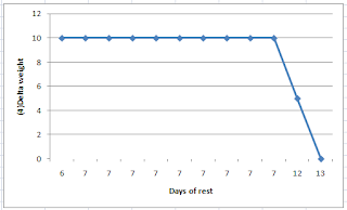
Below are four figures. The first is a table summarizing the data John obtained for his second trial. The other three are outputs from HCE, analogous to those obtained in the first trial: a table showing the coefficients of association between “Delta weight” and the other variables, two graphs (side-by-side) showing “Delta weight” against “Deadlift sets” and “Deadlift reps”, and one graph of “Delta weight” against “Days of rest”. As you can see, “Days of rest” now influences “Delta weight” very strongly. The corresponding association is a very high -0.981! The negative sign means that “Delta weight” decreases as “Days of rest” increase. This does NOT mean that rest is not important; remember, John is now operating on the right side of the J curve, with 6 or more “Days of rest”.


The last graph above suggests that taking 12 or more “Days of rest” shifted things toward the end of the supercompensation window, in fact placing John almost outside of that window at 13 “Days of rest”. Even so, there was no loss of strength, and thus probably no muscle loss. Loss of strength would be suggested by a negative “Delta weight”, which did not occur (the “Delta weight” went down to zero, at 13 “Days of rest”). The two graphs shown side-by-side suggest that 2 “Deadlift sets” seem to work just as well for John as 3 or 4, and that “Deadlift reps” in the 18-24 range also work well for John.

In this second trial, John achieved a better gain over a similar time period than in the first trial. That was a 36 percent gain from the baseline “Deadlift weight”, a gain calculated as: (355-260)/260. John started with a lower baseline than in the end of the first trial period, probably due to detraining, but achieved a final “Deadlift weight” that was likely very close to his maximum potential (at the reps used). Because of this, the 36 percent gain in the period is a lot more impressive than it looks, as it happened toward the end of a saturation curve (e.g., the far right end of a logarithmic curve).

One important thing to keep in mind is that if an HCE user identifies a nonlinear relationship of the J-curve type by inspecting the graphs like John did, in further analyses the focus should be on the right or left side of the curve by either: splitting the dataset into two, and running a separate analysis for each new dataset; or running a new trial, now sticking with a range of variation on the right or left side of the curve, as John did. The reason is that nonlinear relationships tend to distort the linear coefficients calculated by HCE, hiding a real relationship between two variables.

This is a very simplified example. Most serious bodybuilders will measure variations in a number of variables at the same time, for a number of different exercise types and formats, and for longer periods. That is, their “HealthData” sheet in HCE will be a lot more complex. They will also have multiple instances of HCE running on their computer. HCE is a collection of sheets and code that can be copied, and saved with different names. The default is “HCE_1_0.xls” or “HCE_1_0.xlsm”, depending on which version you are using. Each new instance of HCE may contain a different dataset for analysis, stored in the “HealthData” sheet.

It is strongly recommended that you keep your data in a separate set of sheets, as a backup. That is, do not store all your data in the “HealthData” sheets in different HCE instances. Also, when you copy your data into the “HealthData” sheet in HCE, copy only the values and formats, and NOT the formulas. If you copy the formulas, you may end up having some problems, as some of the cells in the “HealthData” sheet will not be storing values. I also recommend storing values for other types variables, particularly perception-based variables.

Examples of perception-based variables are: “Perceived stress”, “Perceived delayed onset muscle soreness (DOMS)”, and “Perceived non-DOMS pain”. These can be answered on Likert-type scales, such as scales going from 1 (very strongly disagree) to 7 (very strongly agree) in response to self-prepared question-statements like “I feel stressed out” (for “Perceived stress”). If you find that a variable like “Perceived non-DOMS pain” is associated with working out at a particular volume range, that may help you avoid serious injury in the future, as non-DOMS pain is not a very good sign (). You also may find that working out in the volume range that is associated with non-DOMS pain adds nothing in terms of muscle gain.

Generally speaking, I think that many people will find out that their sweet spot for muscle gain involves less frequent exercise at lower volumes than they think. Still, each individual is unique; there is no one quite like John. The relationship between “Delta weight” and “Days of rest” varies from person to person based on age; older folks generally require more rest. It also varies based on whether the person is dieting or not; less food intake leads to longer recovery periods. Women will probably see visible lower-body muscle gain, but very little visible upper-body muscle gain (in the absence of steroid use), even as they experience upper-body strength gains. Other variables of interest for both men and women may be body weight, body fat percentage, and perceived muscle tone.

Wednesday, December 7, 2011

Is a Pizza a vegetable?

Thank you SO MUCH for all the thoughts and comments on the manifesto part 1. Everything is valid and will be thrown in the mix for part 2. Sorry for my slow response if you've emailed me whilst I've been in Australia. I am back in the UK now and will be updating this blog in the manner in which you are accustomed to.

So for now, and to get us in the mood for all that 2012 offers, a question.
IS A PIZZA A VEGETABLE?
It appears that congress thinks so. Read on by clicking on the pizza!
Best things, Clive

Monday, December 5, 2011

Want to make coffee less acidic? Add cream to it

The table below is from a 2008 article by Ehlen and colleagues (), showing the amount of erosion caused by various types of beverages, when teeth were exposed to them for 25 h in vitro. Erosion depth is measured in microns. The third row shows the chance probabilities (i.e., P values) associated with the differences in erosion of enamel and root.


As you can see, even diet drinks may cause tooth erosion. That is not to say that if you drink a diet soda occasionally you will destroy your teeth, but regular drinking may be a problem. I discussed this study in a previous post (). After that post was published here some folks asked me about coffee, so I decided to do some research.

Unfortunately coffee by itself can also cause some erosion, primarily because of its acidity. Generally speaking, you want a liquid substance that you are interested in drinking to have a pH as close to 7 as possible, as this pH is neutral (). Tap and mineral water have a pH that is very close to 7. Black coffee seems to have a pH of about 4.8.

Also problematic are drinks containing fermentable carbohydrates, such as sucrose, fructose, glucose, and lactose. These are fermented by acid-producing bacteria. Interestingly, when fermentable carbohydrates are consumed as part of foods that require chewing, such as fruits, acidity is either neutralized or significantly reduced by large amounts of saliva being secreted as a result of the chewing process.

So what to do about coffee?

One possible solution is to add heavy cream to it. A small amount, such as a teaspoon, appears to bring the pH in a cup of coffee to a little over 6. Another advantage of heavy cream is that it has no fermentable carbohydrates; it has no carbohydrates, period. You will have to get over the habit of drinking sweet beverages, including sweet coffee, if you were unfortunate enough to develop that habit (like so many people living in cities today).

It is not easy to find reliable pH values for various foods. I guess dentistry researchers are more interested in ways of repairing damage already done, and there doesn't seem to be much funding available for preventive dentistry research. Some pH testing results from a University of Cincinnati college biology page were available at the time of this writing; they appeared to be reasonably reliable the last time I checked them ().

Monday, November 28, 2011

Triglycerides, VLDL, and industrial carbohydrate-rich foods

Below are the coefficients of association calculated by HealthCorrelator for Excel (HCE) for user John Doe. The coefficients of association are calculated as linear correlations in HCE (). The focus here is on the associations between fasting triglycerides and various other variables. Take a look at the coefficient of association at the top, with VLDL cholesterol, indicated with a red arrow. It is a very high 0.999.


Whoa! What is this – 0.999! Is John Doe a unique case? No, this strong association between fasting triglycerides and VLDL cholesterol is a very common pattern among HCE users. The reason is simple. VLDL cholesterol is not normally measured directly, but typically calculated based on fasting triglycerides, by dividing the fasting triglycerides measurement by 5. And there is an underlying reason for that - fasting triglycerides and VLDL cholesterol are actually very highly correlated, based on direct measurements of these two variables.

But if VLDL cholesterol is calculated based on fasting triglycerides (VLDL cholesterol  = fasting triglycerides / 5), how come the correlation is 0.999, and not a perfect 1? The reason is the rounding error in the measurements. Whenever you see a correlation this high (i.e., 0.999), it is reasonable to suspect that the source is an underlying linear relationship disturbed by rounding error.

Fasting triglycerides are probably the most useful measures on standard lipid panels. For example, fasting triglycerides below 70 mg/dl suggest a pattern of LDL particles that is predominantly of large and buoyant particles. This pattern is associated with a low incidence of cardiovascular disease (). Also, chronically high fasting triglycerides are a well known marker of the metabolic syndrome, and a harbinger of type 2 diabetes.

Where do large and buoyant LDL particles come from? They frequently start as "big" (relatively speaking) blobs of fat, which are actually VLDL particles. The photo is from the excellent book by Elliott & Elliott (); it shows, on the same scale: (a) VLDL particles, (b) chylomicrons, (c) LDL particles, and (d) HDL particles. The dark bar at the bottom of each shot is 1000 A in length, or 100 nm (A = angstrom; nm = nanometer; 1 nm = 10 A).


If you consume an excessive amount of carbohydrates, my theory is that your liver will produce an abnormally large number of small VLDL particles (also shown on the photo above), a proportion of which will end up as small and dense LDL particles. The liver will do that relatively quickly, probably as a short-term compensatory mechanism to avoid glucose toxicity. It will essentially turn excess glucose, from excess carbohydrates, into fat. The VLDL particles carrying that fat in the form of triglycerides will be small because the liver will be in a hurry to clear the excess glucose in circulation, and will have no time to produce large particles, which take longer to produce individually.

This will end up leading to excess triglycerides hanging around in circulation, long after they should have been used as sources of energy. High fasting triglycerides will be a reflection of that. The graphs below, also generated by HCE for John Doe, show how fasting triglycerides and VLDL cholesterol vary in relation to refined carbohydrate consumption. Again, the graphs are not identical in shape because of rounding error; the shapes are almost identical.


Small and dense LDL particles, in the presence of other factors such as systemic inflammation, will contribute to the formation of atherosclerotic plaques. Again, the main source of these particles would be an excessive amount of carbohydrates. What is an excessive amount of carbohydrates? Generally speaking, it is an amount beyond your liver’s capacity to convert the resulting digestion byproducts, fructose and glucose, into liver glycogen. This may come from spaced consumption throughout the day, or acute consumption in an unnatural form (a can of regular coke), or both.

Liver glycogen is sugar stored in the liver. This is the main source of sugar for your brain. If your blood sugar levels become too low, your brain will get angry. Eventually it will go from angry to dead, and you will finally find out what awaits you in the afterlife.

Should you be a healthy athlete who severely depletes liver glycogen stores on a regular basis, you will probably have an above average liver glycogen storage and production capacity. That will be a result of long-term compensatory adaptation to glycogen depleting exercise (). As such, you may be able to consume large amounts of carbohydrates, and you will still not have high fasting triglycerides. You will not carry a lot of body fat either, because the carbohydrates will not be converted to fat and sent into circulation in VLDL particles. They will be used to make liver glycogen.

In fact, if you are a healthy athlete who severely depletes liver glycogen stores on a regular basis, excess calories will be just about the only thing that will contribute to body fat gain. Your threshold for “excess” carbohydrates will be so high that you will feel like the whole low carbohydrate community is not only misguided but also part of a conspiracy against people like you. If you are also an aggressive blog writer, you may feel compelled to tell the world something like this: “Here, I can eat 300 g of carbohydrates per day and maintain single-digit body fat levels! Take that you low carbohydrate idiots!”

Let us say you do not consume an excessive amount of carbohydrates; again, what is excessive or not varies, probably dramatically, from individual to individual. In this case your liver will produce a relatively small number of fat VLDL particles, which will end up as large and buoyant LDL particles. The fat in these large VLDL particles will likely not come primarily from conversion of glucose and/or fructose into fat (i.e., de novo lipogenesis), but from dietary sources of fat.

How do you avoid consuming excess carbohydrates? A good way of achieving that is to avoid man-made carbohydrate-rich foods. Another is adopting a low carbohydrate diet. Yet another is to become a healthy athlete who severely depletes liver glycogen stores on a regular basis; then you can eat a lot of bread, pasta, doughnuts and so on, and keep your fingers crossed for the future.

Either way, fasting triglycerides will be strongly correlated with VLDL cholesterol, because VLDL particles contain both triglycerides (“encapsulated” fat, not to be confused with “free” fatty acids) and cholesterol. If a large number of VLDL particles are produced by one’s liver, the person’s fasting triglycerides reading will be high. If a small number of VLDL particles are produced, even if they are fat particles, the fasting triglycerides reading will be relatively low. Neither VLDL cholesterol nor fasting triglycerides will be zero though.

Now, you may be wondering, how come a small number of fat VLDL particles will eventually lead to low fasting triglycerides? After all, they are fat particles, even though they occur in fewer numbers. My hypothesis is that having a large number of small-dense VLDL particles in circulation is an abnormal, unnatural state, and that our body is not well designed to deal with that state. Use of lipoprotein-bound fat as a source of energy in this state becomes somewhat less efficient, leading to high triglycerides in circulation; and also to hunger, as our mitochondria like fat.

This hypothesis, and the theory outlined above, fit well with the numbers I have been seeing for quite some time from HCE users. Note that it is a bit different from the more popular theory, particularly among low carbohydrate writers, that fat is force-stored in adipocytes (fat cells) by insulin and not released for use as energy, also leading to hunger. What I am saying here, which is compatible with this more popular theory, is that lipoproteins, like adipocytes, also end up holding more fat than they should if you consume excess carbohydrates, and for longer.

Want to improve your health? Consider replacing things like bread and cereal with butter and eggs in your diet (). And also go see you doctor (); if he disagrees with this recommendation, ask him to read this post and explain why he disagrees.

Monday, November 21, 2011

My transformation: How I looked 10 years ago next to a thin man called Royce Gracie

The photos below were taken about 10 years ago. The first is at a restaurant near Torrance, California. (As you can see, the restaurant was about to close; we were the last customers.) I am standing next to Royce Grace, who had by then become a sensation (). He became a sensation by easily defeating nearly every champion fighter that was placed in front of him. In case you are wondering, Royce is 6’1” and I am 5’8”. The second photo also has Royce’s manager in it – that is his wife. Their children’s names both start with the letter “K”. I wonder how big they are right now.


I think that at the time these photos were taken I weighed around 200-210 lbs. Even though I am much shorter than Royce, I outweighed him by around 40 lbs. Now I weigh 150 lbs, at about 11 percent body fat, and look like the photo on the top-right area of this blog - essentially like a thin guy who does some manual labor for a living, I guess. A post is available discussing the "how" part of this transformation (). I only put a shirtless photo here after several readers told me that my previous photo looked out of place in this blog.

My day job is not even remotely related to fitness instruction. I am a college professor, and like to think of myself as a scholar. I don’t care much about my personal appearance; never did. At least in my mind, putting up shirtless photos on the web should not be done gratuitously. If you are a fitness instructor, or an athlete, that is fine. In my case, it is acceptable in the context of telling people that a few minutes of mid-day sun exposure, avoiding sunburn, yields 10,000 IU of skin-produced vitamin D, which is about 20 times more than one can get through most "fortified" industrial foods.

Royce is such a nice guy that, after much insistence, he paid for the dinner, and then we drove to his house and talked until about midnight. He had told me of a flight the next morning to Chicago, so I ended the interview and thanked him for the wonderful time we had spent together. I had to talk him out of driving ahead of me to I-405; he wanted to make sure I was not going to get lost at that time of the night. This was someone who was considered a demigod at the time in some circles. A humble, wonderful person.

Royce helped launch what is today the mega-successful Ultimate Fighting Championship franchise (), which was then still a no holders barred mixed martial arts tournament. At the time the photos were taken I was interviewing him for my book Compensatory Adaptation, which came out in print soon after (). The book has a full chapter on the famous Gracie Family, including his father Helio and his brother Rickson.

I talked before about the notion of compensatory adaptation and how it applies to our understanding of how we respond to diet and lifestyle changes (). In this context, I believe that the compensatory adaptation notion is far superior to that of hormesis (), which I think is interesting but overused and overrated.

The notion of compensatory adaptation has been picked up in the field of information systems, my main field of academic research. In this field, which deals with how people respond to technologies, it is part of a broader theory called media naturalness theory (). There are already several people who have received doctorates by testing this theory from novel angles. There are also several people today who call themselves experts in compensatory adaptation and media naturalness theory.

The above creates an odd situation, and something funny that happened with me a few times already. I do some new empirical research on compensatory adaptation, looking at it from a new angle, write an academic paper about it (often with one or more co-authors who helped me collect empirical data), and submit it to a selective refereed journal. Then an "expert" reviewer, who does not know who the authors of the paper are (this is called a "blind" review), recommends rejection of the paper because “the authors of this paper clearly do not understand the notion of compensatory adaptation”. Sometimes something like this is added: “the authors should read the literature on compensatory adaptation more carefully, particularly Kock (2004)” - an article that has a good number of citations to it ().

Oh well, the beauty of the academic refereeing process …

Sunday, November 13, 2011

Eating Pace and Protein to Control Overeating

One matter that most evidence-based nutritionists and dietitians will agree on is that humans have evolved to be experts in the task of seeking out palatable foods, which generally contain a combination of sugar, fat, and salt. These nutrients, usually scarce over the long span of evolutionary time and highly valued, are what helped lead to the development of our senses.

Nowadays, it is still the sight, aroma, and taste of food powered by sugar-fat-salt reward and satisfaction that still guides our eating decisions, except in a modern environment of widely available food and sedentary lifestyles.

The axe that nutritionists have to grind with food manufacturers is the blatant targeting of our senses with   layer upon layer of bold sugar-fat-salt flavors -- think of potato chips dipped in artichoke dip, French fries and ketchup, pizza topped with pepperoni, and so on. According to David Kessler, these foods are so powerfully appealing to our senses that they may even alter our brain chemistry driving our appetites for more.
In any case, any nutritionist should agree, these processed foods being higher in sugar, fat, salt also usually come at the expense of other nutrients like protein, fiber, vitamins, and minerals.

With the holidays around the corner, it's the time of year when folks look for advice on how to avoid putting on 10 or more pounds by the new year. Recently, a couple of studies offer a couple of possible pointers on what might help folks still enjoy the festivities but control their appetites well enough to stay on track with their health and weight-management goals.

Pay attention to percent protein  

Eating foods with a higher percent of calories from protein could help control appetite, according to new randomized controlled experiment published in PLoS One (1). Scientists tested "the protein leverage hypothesis" on lean men and women by feeding them foods with similar palatability but with macronutrient composition disguised under ad libitum (all you can eat) conditions. They studied the subjects over four-day periods with fixed menus containing either 10, 15, or 25 percent calories from protein.

The scientists noted that subjects eating a 10 percent protein diet ate an average of 12 percent more calories over the four days, almost 60 percent of which came from savory foods. Seventy percent of the caloric increase came from eating "snack foods." If the subjects on the 10 percent protein diet kept at it, without an increase in energy expenditure from increased activity, they'd likely put on about 2 pounds of weight per month, the scientists report.

“In our study population a change in the nutritional environment that dilutes dietary protein with carbohydrate and fat promotes overconsumption, enhancing the risk for potential weight gain,” the authors wrote.

Pace yourself when you eat

Another pointer is to take time to really enjoy foods. Yet two more studies, presented at the Obesity Society in Orlando this month, (2) suggest that there may just be something to the idea of eating more slowly to help control calories, although I realize that the evidence of these may have similar problems of earlier studies' methodology. The studies found that men usually ate faster than women, heavier faster than lighter, and that refined grains were eaten faster than whole grains (whole grains require more chewing because they're more fibrous).

"It takes time for your body to process fullness signals," said lead researcher Kathleen Melanson in a press release, "so slower eating may allow time for fullness to register in the brain before you've eaten too much."

Previously, Melanson's lab was the first to find in 2007 that eating slowly actually led people to eat fewer calories overall. In that study, women who were told to eat slowly, pausing between bites and chewing slowly, ate about 10 percent fewer calories.

How our ancestors ate

Looking back on how our ancestors ate, the majority of their diet being lean meats combined with fibrous fruits and vegetables, it only makes sense that the pointers above could help keep us in line with a style of eating more appropriate for our genetic make-up.

Paying more attention to the percent of protein in foods (and fiber too) and how fast foods are eaten could help cut calories and the weight off. The higher percent of protein in a meal and eating over a longer period of time might also help with maintaining healthy blood sugar levels.

With an abundance of highly palatable goodies available these days, especially during the holidays, it's worth keeping in mind these strategies to help guard against how fat, sugar and salt affect our brains and compel us to overeat.

References

1. Gosby AK, Conigrave AD, Lau NS et al. Testing protein leverage in lean humans: a randomised controlled experimental study. PLoS One 2011;6:e25929. doi:  10.1371/journal.pone.0025929
2. McLeish T. Researcher provides further evidence that slow eating reduces food intake. University of Rhode Island. 2011.

Saturday, November 5, 2011

The China Study II: How gender takes us to the elusive and deadly factor X

The graph below shows the mortality in the 35-69 and 70-79 age ranges for men and women for the China Study II dataset. I discussed other results in my two previous posts () (), all taking us to this post. The full data for the China Study II study is publicly available (). The mortality numbers are actually averages of male and female deaths by 1,000 people in each of several counties, in each of the two age ranges.


Men do tend to die earlier than women, but the difference above is too large.

Generally speaking, when you look at a set time period that is long enough for a good number of deaths (not to be confused with “a number of good deaths”) to be observed, you tend to see around 5-10 percent more deaths among men than among women. This is when other variables are controlled for, or when men and women do not adopt dramatically different diets and lifestyles. One of many examples is a study in Finland (); you have to go beyond the abstract on this one.

As you can see from the graph above, in the China Study II dataset this difference in deaths is around 50 percent!

This huge difference could be caused by there being significantly more men than women per county included the dataset. But if you take a careful look at the description of the data collection methods employed (), this does not seem to be the case. In fact, the methodology descriptions suggest that the researchers tried to have approximately the same number of women and men studied in each county. The numbers reported also support this assumption.

As I said before, this is a well executed research project, for which Dr. Campbell and his collaborators should be commended. I may not agree with all of their conclusions, but this does not detract even a bit from the quality of the data they have compiled and made available to us all.

So there must be another factor X causing this enormous difference in mortality (and thus longevity) among men and women in the China Study II dataset.

What could be this factor X?

This situation helps me illustrate a point that I have made here before, mostly in the comments under other posts. Sometimes a variable, and its effects on other variables, are mostly a reflection of another unmeasured variable. Gender is a variable that is often involved in this type of situation. Frequently men and women do things very differently in a given population due to cultural reasons (as opposed to biological reasons), and those things can have a major effect on their health.

So, the search for our factor X is essentially a search for a health-relevant variable that is reflected by gender but that is not strictly due to the biological aspects that make men and women different (these can explain only a 5-10 percent difference in mortality). That is, we are looking for a variable that shows a lot of variation between men and women, that is behavioral, and that has a clear impact on health. Moreover, as it should be clear from my last post, we are looking for a variable that is unrelated to wheat flour and animal protein consumption.

As it turns out, the best candidate for the factor X is smoking, particularly cigarette smoking.

The second best candidate for factor X is alcohol abuse. Alcohol abuse can be just as bad for one’s health as smoking is, if not worse, but it may not be as good a candidate for factor X because the difference in prevalence between men and women does not appear to be just as large in China (). But it is still large enough for us to consider it a close second as a candidate for factor X, or a component of a more complex factor X – a composite of smoking, alcohol abuse and a few other coexisting factors that may be reflected by gender.

I have had some discussions about this with a few colleagues and doctoral students who are Chinese (thanks William and Wei), and they mentioned stress to me, based on anecdotal evidence. Moreover, they pointed out that stressful lifestyles, smoking, and alcohol abuse tend to happen together - with a much higher prevalence among men than women.

What an anti-climax for this series of posts eh?

With all the talk on the Internetz about safe and unsafe starches, animal protein, wheat bellies, and whatnot! C’mon Ned, give me a break! What about insulin!? What about leucine deficiency … or iron overload!? What about choline!? What about something truly mysterious, related to an obscure or emerging biochemistry topic; a hormone du jour like leptin perhaps? Whatever, something cool!

Smoking and alcohol abuse!? These are way too obvious. This is NOT cool at all!

Well, reality is often less mysterious than we want to believe it is.

Let me focus on smoking from here on, since it is the top candidate for factor X, although much of the following applies to alcohol abuse and a combination of the two as well.

One gets different statistics on cigarette smoking in China depending on the time period studied, but one thing seems to be a common denominator in these statistics. Men tend to smoke in much, much higher numbers than women in China. And this is not a recent phenomenon.

For example, a study conducted in 1996 () states that “smoking continues to be prevalent among more men (63%) than women (3.8%)”, and notes that these results are very similar to those in 1984, around the time when the China Study II data was collected.

A 1995 study () reports similar percentages: “A total of 2279 males (67%) but only 72 females (2%) smoke”. Another study () notes that in 1976 “56% of the men and 12% of the women were ever-smokers”, which together with other results suggest that the gap increased significantly in the 1980s, with many more men than women smoking. And, most importantly, smoking industrial cigarettes.

So we are possibly talking about a gigantic difference here; the prevalence of industrial cigarette smoking among men may have been over 30 times the prevalence among women in the China Study II dataset.

Given the above, it is reasonable to conclude that the variable “SexM1F2” reflects very strongly the variable “Smoking”, related to industrial cigarette smoking, and in an inverse way. I did something that, grossly speaking, made the mysterious factor X explicit in the WarpPLS model discussed in my previous post. I replaced the variable “SexM1F2” in the model with the variable “Smoking” by using a reverse scale (i.e., 1 and 2, but reversing the codes used for “SexM1F2”). The results of the new WarpPLS analysis are shown on the graph below. This is of course far from ideal, but gives a better picture to readers of what is going on than sticking with the variable “SexM1F2”.


With this revised model, the associations of smoking with mortality in the 35-69 and 70-79 age ranges are a lot stronger than those of animal protein and wheat flour consumption. The R-squared coefficients for mortality in both ranges are higher than 20 percent, which is a sign that this model has decent explanatory power. Animal protein and wheat flour consumption are still significantly associated with mortality, even after we control for smoking; animal protein seems protective and wheat flour detrimental. And smoking’s association with the amount of animal protein and wheat flour consumed is practically zero.

Replacing “SexM1F2” with “Smoking” would be particularly far from ideal if we were analyzing this data at the individual level. It could lead to some outlier-induced errors; for example, due to the possible existence of a minority of female chain smokers. But this variable replacement is not as harmful when we look at county-level data, as we are doing here.

In fact, this is as good and parsimonious model of mortality based on the China Study II data as I’ve ever seen based on county level data.

Now, here is an interesting thing. Does the original China Study II analysis of univariate correlations show smoking as a major problem in terms of mortality? Not really.

The table below, from the China Study II report (), shows ALL of the statistically significant (P<0.05) univariate correlations with mortality in 70-79 age range. I highlighted the only measure that is directly related to smoking; that is “dSMOKAGEm”, listed as “questionnaire AGE MALE SMOKERS STARTED SMOKING (years)”.


The high positive correlation with “dSMOKAGEm” does not even make a lot of sense, as one would expect a negative correlation here – i.e., the earlier in life folks start smoking, the higher should be the mortality. But this reverse-signed correlation may be due to smokers who get an early start dying in disproportionally high numbers before they reach age 70, and thus being captured by another age range mortality variable. The fact that other smoking-related variables are not showing up on the table above is likely due to distortions caused by inter-correlations, as well as measurement problems like the one just mentioned.

As one looks at these univariate correlations, most of them make sense, although several can be and probably are distorted by correlations with other variables, even unmeasured variables. And some unmeasured variables may turn out to be critical. Remember what I said in my previous post – the variable “SexM1F2” was introduced by me; it was not in the original dataset. “Smoking” is this variable, but reversed, to account for the fact that men are heavy smokers and women are not.

Univariate correlations are calculated without adjustments or control. To correct this problem one can adjust a variable based on other variables; as in “adjusting for age”. This is not such a good technique, in my opinion; it tends to be time-consuming to implement, and prone to errors. One can alternatively control for the effects of other variables; a better technique, employed in multivariate statistical analyses. This latter technique is the one employed in WarpPLS analyses ().

Why don’t more smoking-related variables show up on the univariate correlations table above? The reason is that the table summarizes associations calculated based on data for both sexes. Since the women in the dataset smoked very little, including them in the analysis together with men lowers the strength of smoking-related associations, which would probably be much stronger if only men were included. It lowers the strength of the associations to the point that their P values become higher than 0.05, leading to their exclusion from tables like the one above. This is where the aggregation process that may lead to ecological fallacy shows its ugly head.

No one can blame Dr. Campbell for not issuing warnings about smoking, even as they came mixed with warnings about animal food consumption (). The former warnings, about smoking, make a lot of sense based on the results of the analyses in this and the last two posts.

The latter warnings, about animal food consumption, seem increasingly ill-advised. Animal food consumption may actually be protective in regards to the factor X, as it seems to be protective in terms of wheat flour consumption ().